Newsfeed Redesign
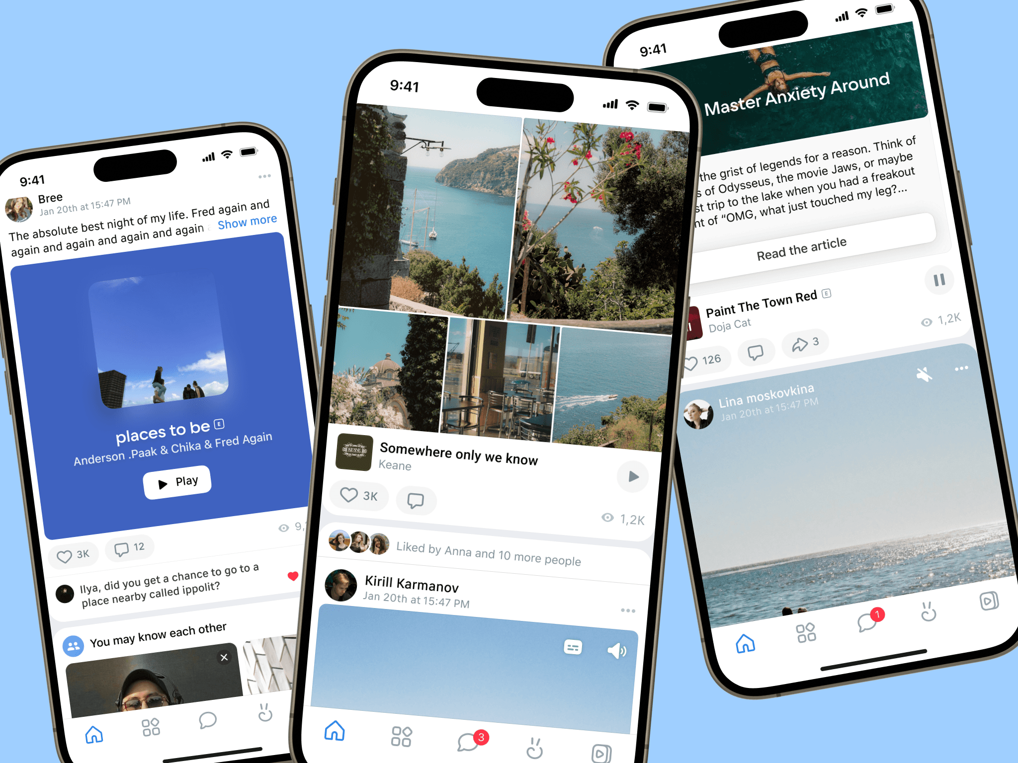
vk.com is the largest Russian social network with millions of visitors. Now it’s more like a super app, where users consume various content, communicate with friends and even order food or a taxi. I worked on the Newsfeed team. Newsfeed is the most visited section of VK — the first thing users see when they open the app. It has over 100 million monthly users.
Setting the Stage: Revamping VK's Digital Heartbeat
The main goal of the redesign was to enhance user engagement metrics. The crucial metric for any social network is time spent. Increasing the time users spend in the Newsfeed directly correlates with higher ad revenue. But how can we increase time spent? Why do people spend time in the Newsfeed?
People spend time on social media because of authors and content they create. Newsfeed algorithms significantly impact the time users spend on VK. Design? Design is also important: enhancements in design can make the consumption experience more engaging and appealing.
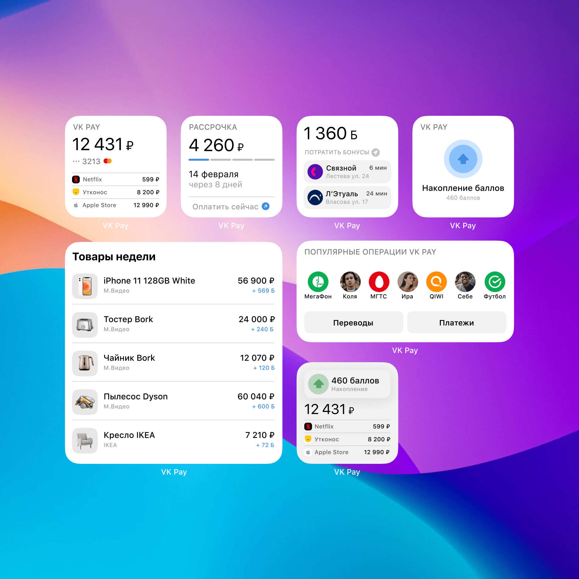
Newsfeed posts may contain a variety of attachments, including photos, music, surveys, files, services, geolocation data, reels, videos, articles, music albums, stickers, podcasts, mini apps, playlists. And more.
Our goals with redesign were increase user engagement and time spent by:
Update Look and Feel
Ensure consistency across all content formats
Enhance equity in content visibility
Challenges in redesigning Newsfeed
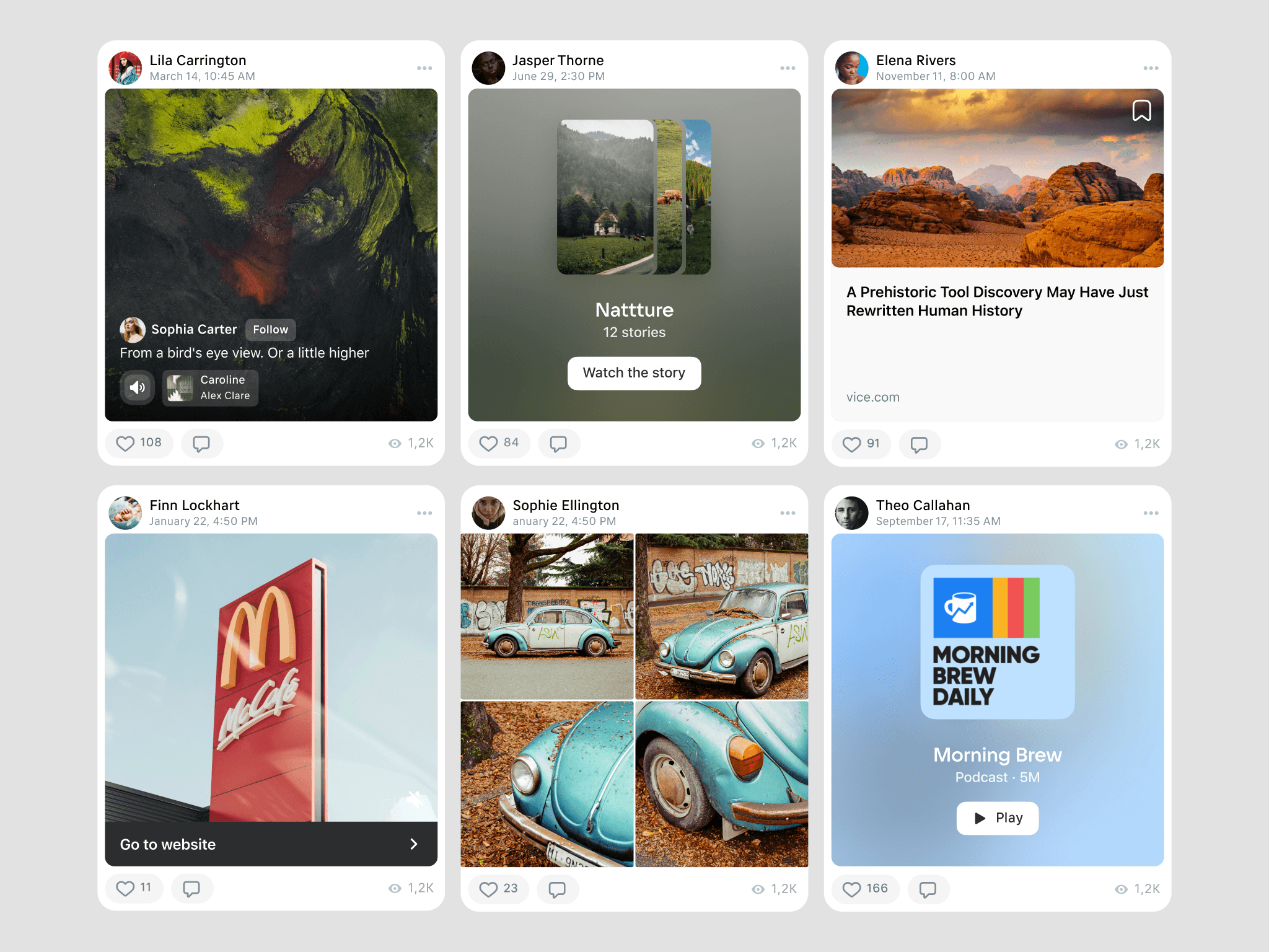
At the beginning, we noticed that some posts appeared larger. Certain post types can overshadow others. Formats like big images or videos often take precedence, making it difficult for other content to gain visibility. Users created posts with varying heights, which presents a significant challenge. Oversized posts lead to user fatigue and create an unfair distribution of attention.
Wide variety (20+) of content formats available on vk.com. Each format has different visual and structural characteristics.
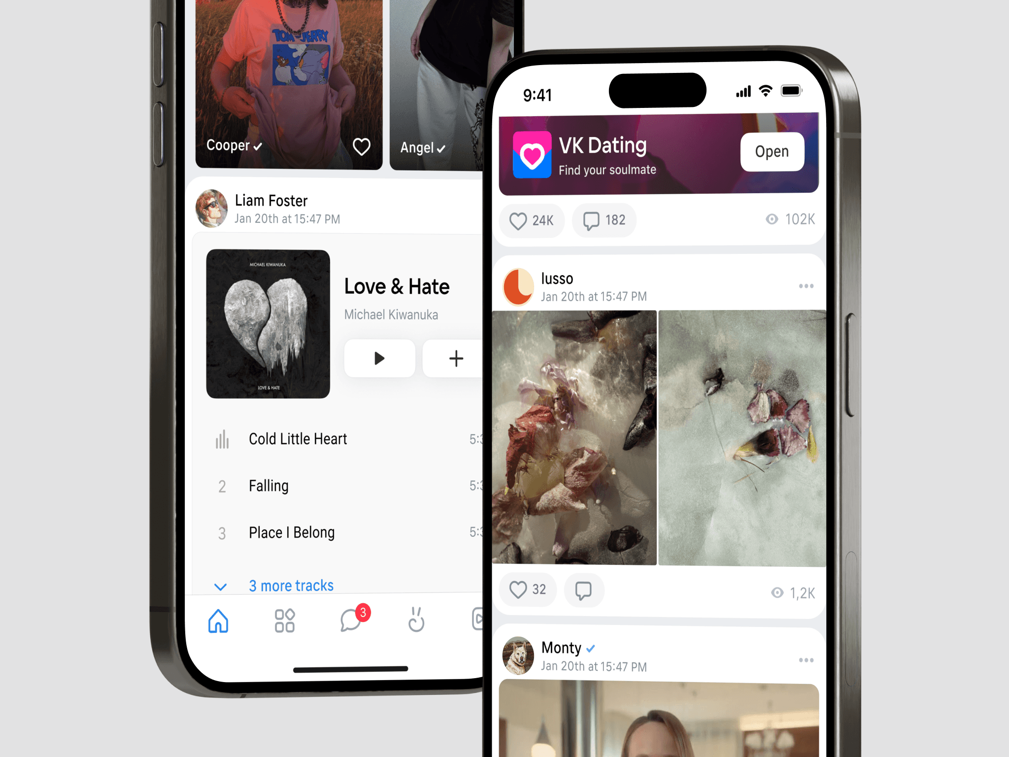
Synchronization with a large number of departments was also crucial. The Newsfeed serves as an entry point to different sections of the platform, each managed by different teams. For example, one department is responsible for Reels, while another manages Mini-applications. Each team aims to drive as much traffic as possible to their section, which complicates the redesign process. Coordinating the redesign required aligning the interests of multiple departments, each focused on optimizing their own metrics, which was a significant organizational challenge.
Sometimes, a design may necessitate a comprehensive update to maintain its appeal and attract attention. In a fast-paced world where trends evolve rapidly, ensuring that a design remains fresh and engaging is crucial for retaining interest and relevance. Regular updates help adapt to new aesthetic preferences and technological advancements, ultimately enhancing user experience and engagement.
Lastly, we needed to ensure that the redesign functions seamlessly across all platforms: Android, iOS, web, and mobile web.
Implementing Primary and Secondary Attachments

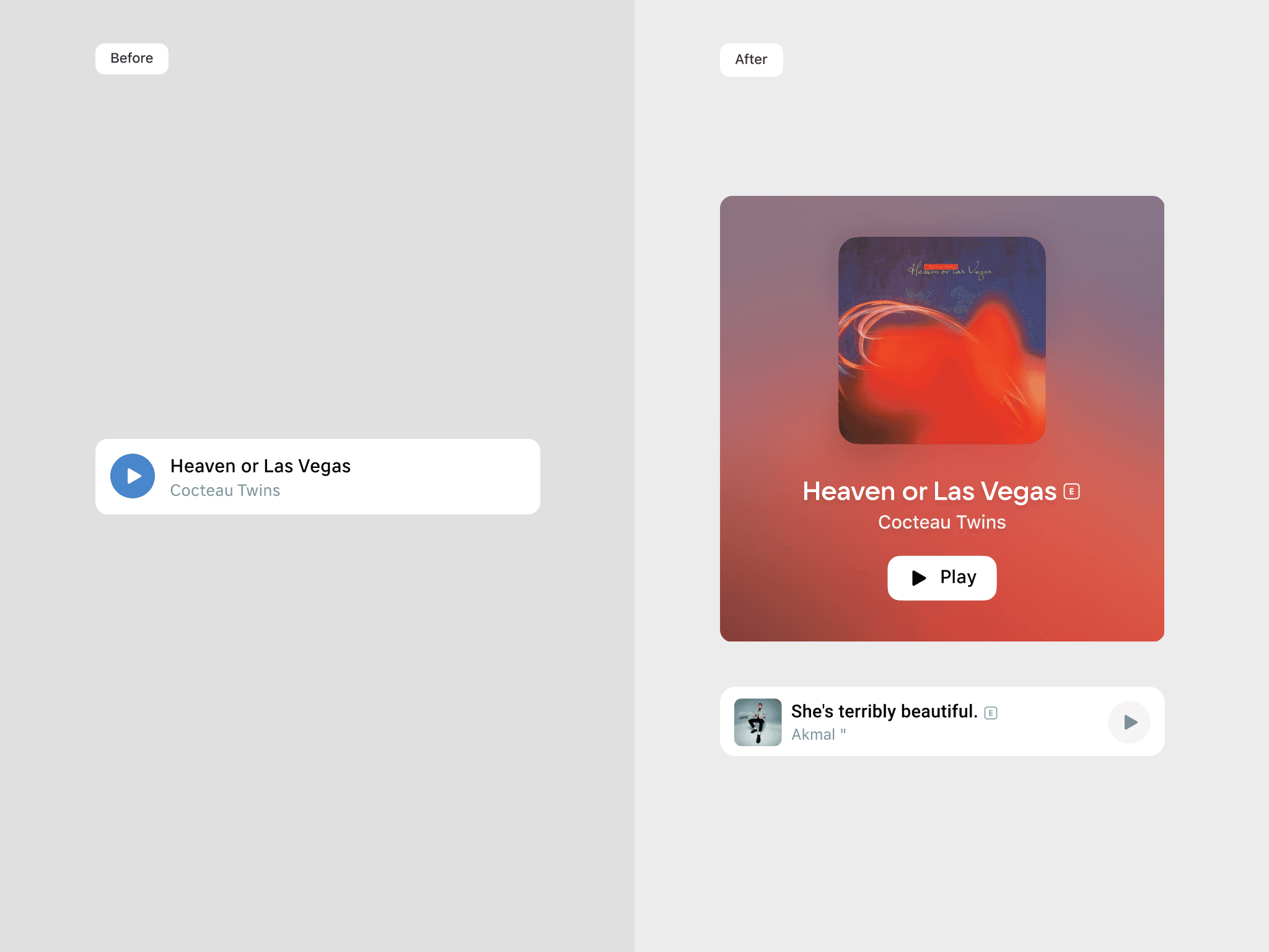
We developed the concept of Primary and Secondary attachments. The Primary attachment was standardized with fixed proportions and offered three display formats: square, horizontal, and vertical. This standardization helped prevent any single post from dominating the Newsfeed due to its size, ensuring a more uniform and balanced presentation of content.
Implementing the Redesign: Concepts, Collaboration, and Testing
Next, we developed concepts based on the new vision: standardizing the attention allocated to each post, regardless of the type of attachment. We also introduced a more appealing look and feel, incorporating additional rounded elements. Some attachments were enhanced by adding attractive call-to-action (CTA) buttons.

To meet the expectations of all teams, we initiated collaborative brainstorming sessions. These sessions led to a consensus on the new Newsfeed design, ensuring it met the diverse requirements of different content formats while maintaining a unified look and feel.
After the redesign was completed, we conducted A/B testing to measure its impact on key metrics. Not all changes resulted in positive outcomes; some had to be abandoned, while others were adjusted for better results.
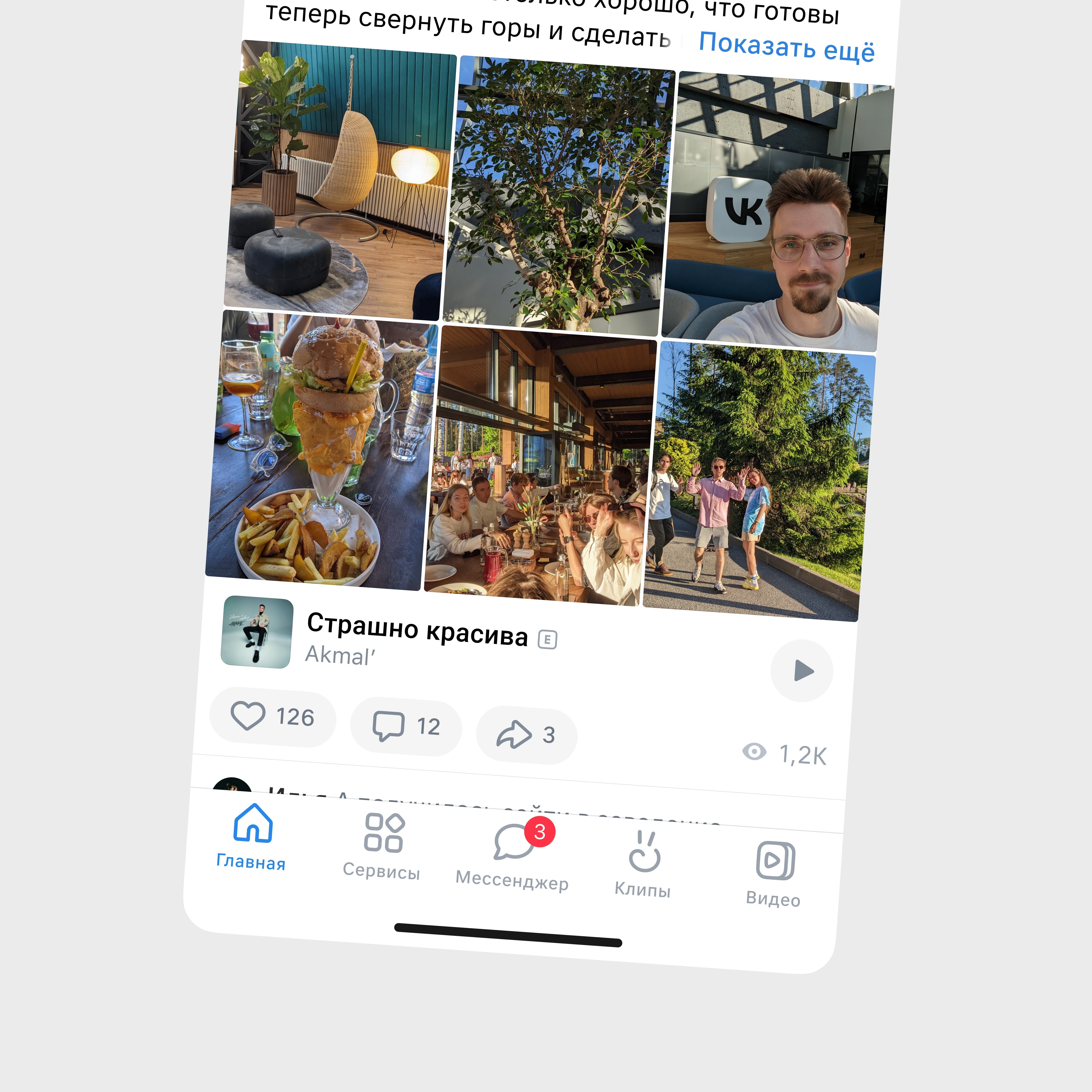
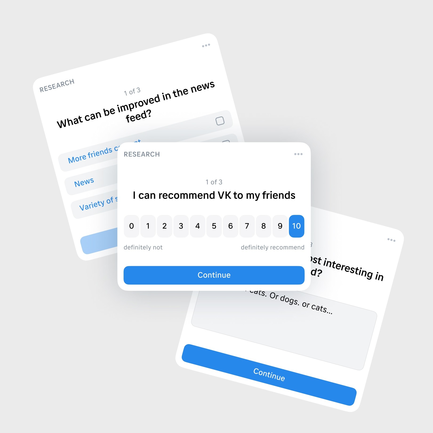
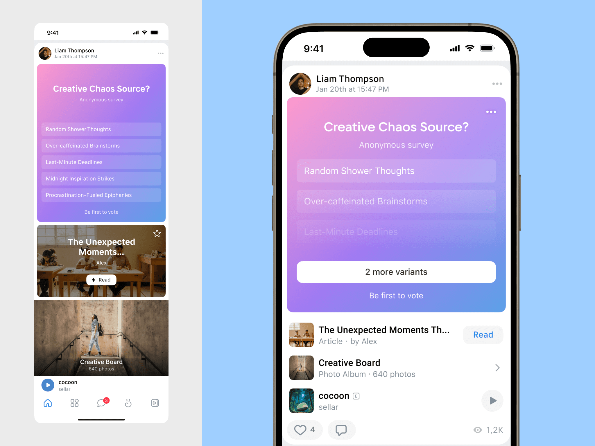
For example, the concept of surveys needed to be reworked several times. Multiple-choice polls were cumbersome and distracting, so we decided to hide the survey answers in a modal window. Tests on the number of interactions with the survey showed that this change did not negatively impact engagement; in fact, it improved the overall metrics of the feed.
Look, this is the same post:
Results
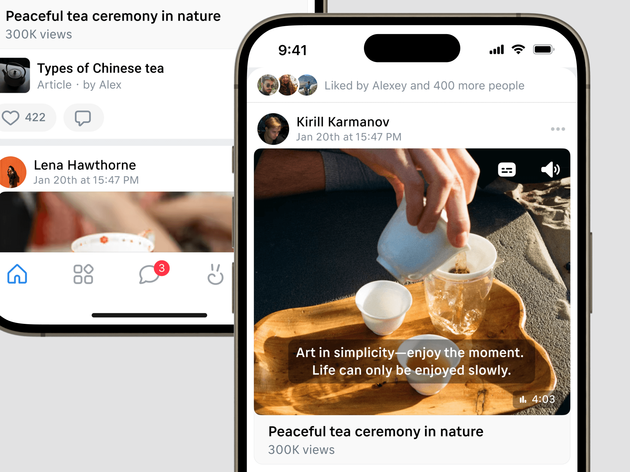
The redesign led to a measurable increase in the key metric of “Time Spent”, directly contributing to higher ad impressions and increased revenue for vk.com. The standardized post heights and the more visually cohesive Newsfeed made it easier for users to engage with a variety of content types, keeping them on the platform longer.
Internal teams, who were initially concerned about how the redesign might impact their specific metrics, reported satisfaction with the outcomes. An unexpected positive result was a significant increase in the use of the article format, driven by the new feature allowing part of an article’s content to be displayed directly in the Newsfeed.


